Artworks by Janice Clements and Kristjana Gunnars

AUG 5–30, 2025
THE CULTCH GALLERY

AUG 06: Opening Reception

AUG 06: Opening Reception

Opening reception with the artists in attendance

AUG 06, 2025 from 6–8 PM

This event is FREE and open to the public!

Appetizers will be served and the cash bar will be open offering alcoholic and non-alcoholic beverages, tea, coffee and snacks.

Phone:604-251-1363
Email: [email protected]

Summer Hours
Monday to Friday: 12–4pm
Saturday & Sunday: Closed

Open 1 hour prior to every show
Venue Info

THE CULTCH GALLERY
1895 Venables St.

DIRECTIONS

Signup for The Cultch Gallery Newsletter
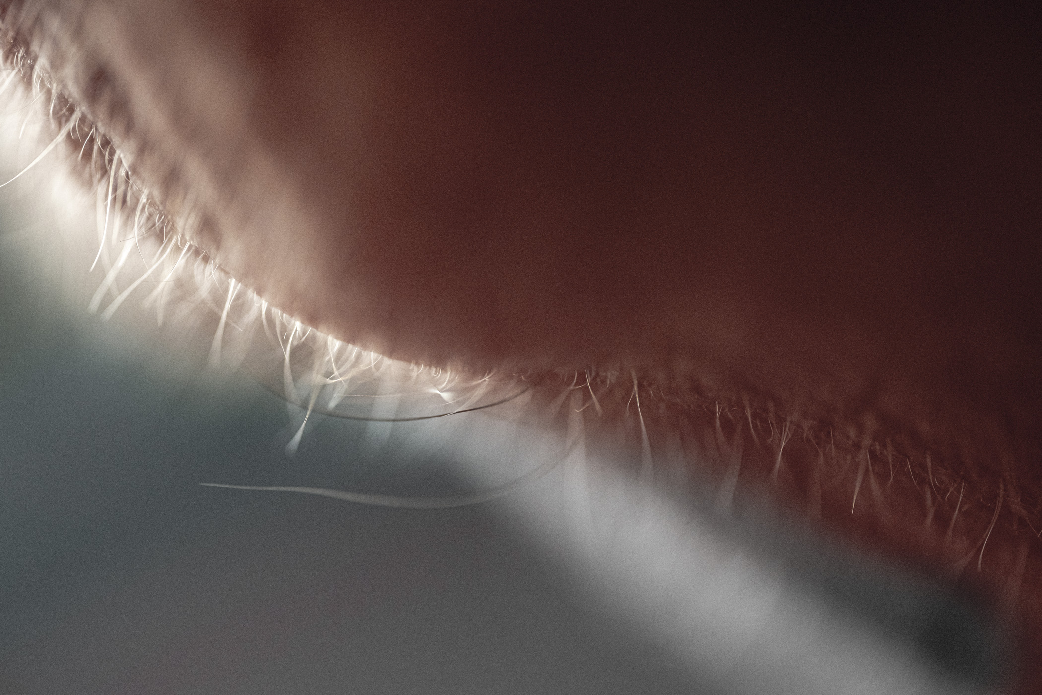
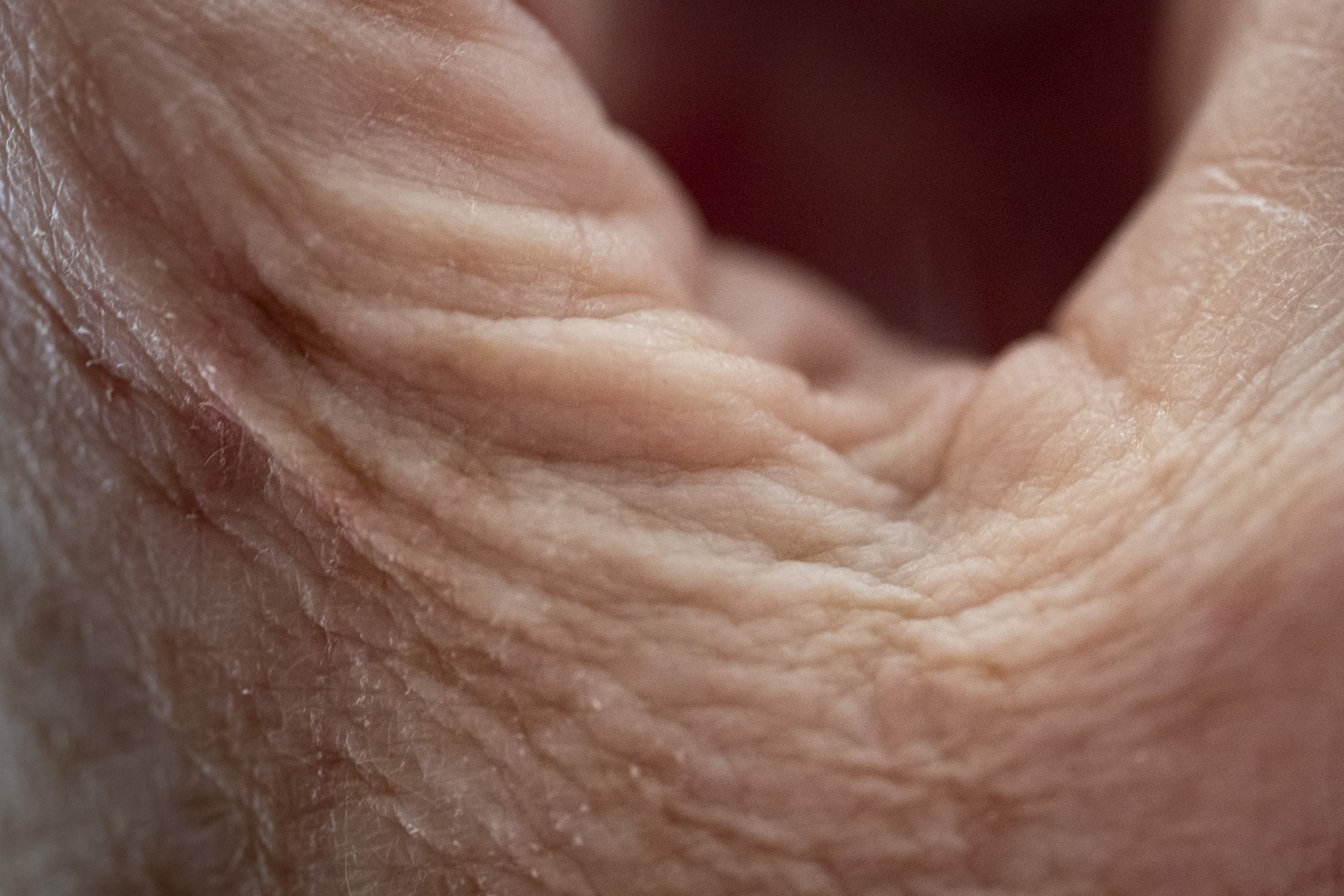
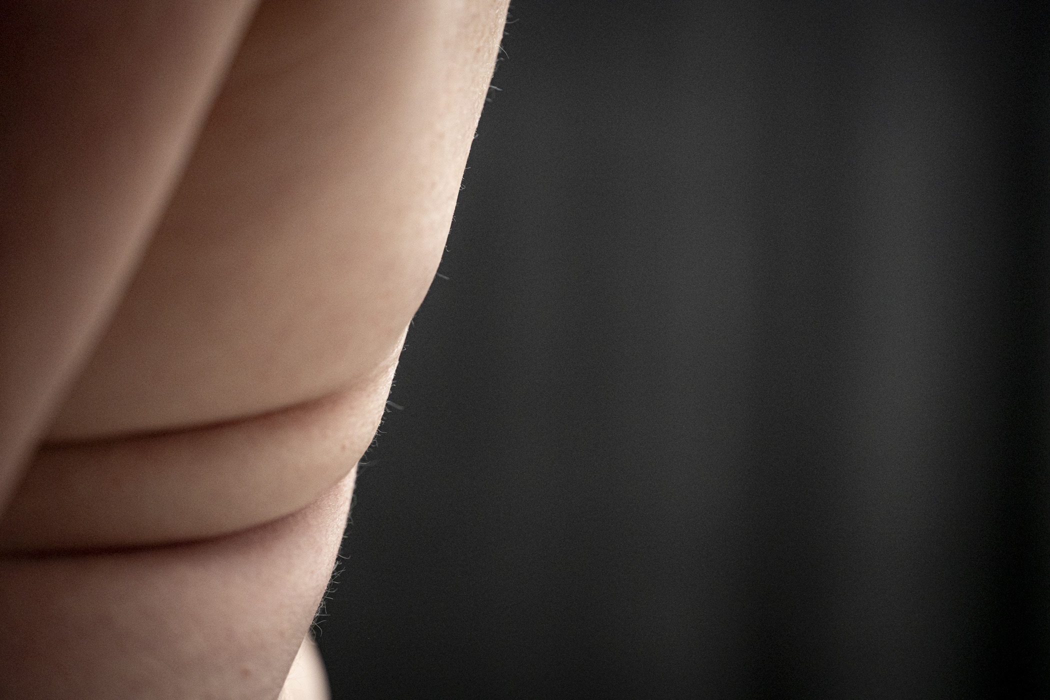
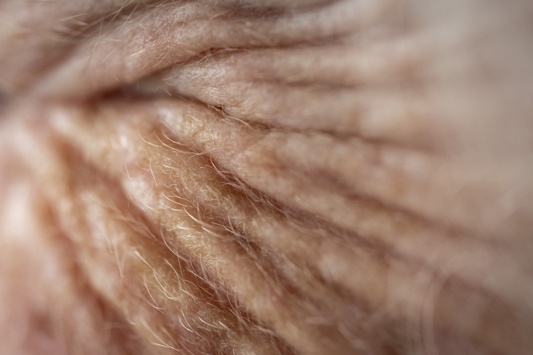
 

About: Janice Clements

Janice is a multi disciplinary artist, born and lives in British Columbia, Canada. Her creative journey spans the realms of interior design, film and fine art. Starting with a foundation career built on applied arts and interior design, she honed her, skills before transitioning into the film industry where they excelled as a Set Designer and Assistant Art Director. Janice’s professional experiences not only refined her eye for detail and spatial composition but also deepened her storytelling through visual mediums. Throughout her career she has constantly nurtured a parallel passion for fine art, dedicating time to study and experiment with different mediums, techniques and methods, This ongoing exploration has allowed her practice to form a unique voice, blending technical expertise with a profound curiosity for materiality and process. Janice is current art studio practice is in the Arts Factory. Experimenting with mixed media that involve painting, drawing, collaging and diverse printing techniques. Her pieces evolve with layers of applications. Janice’s work is characterized by layered introspective compositions of mark making that invite viewers to engage in an interplay of texture, form, and colour. Her art resonates with both personal and universal themes offering a glimpse into the complexities of human experience. Janice’s objective is to continue to push the boundaries of her practice, embracing the transformational power of art to connect, reflect, inspire and to be inspired.

Artist Statement: Kristjana Gunnars

Kristjanagunnarspaintings.com

On Silent Wings

In northern Europe—the Nordic countries—it was understood in the old days that painting was something men did and fibre work (like weaving, sewing, knitting) was something women did.  I grew up in Scandinavia and was trained as a girl in weaving and embroidery and knitting and the uses of fibre in daily life.  My father’s cousin, in whose home I spent so much of my childhood, was a seaman and when he was not at sea he was a painter in his loft studio.  I watched him work on his marine oil paintings and was enthralled.  At the same time, my mother was an accomplished fibre artist.  She had a large loom that took up most of the space in the living area of our home, where she created tapestries and rugs.  She also knitted and embroidered amazingly, and I followed her work with great interest, watching her in silence working on her loom while singing to herself.

Eventually I turned to painting and pursued the visual arts both as a practice and as a subject of study.  I have written and given talks and presentations on the history of abstract art and on the Arts and Crafts movement.  This movement appeared both in Europe and in Japan, and am indebted to Japanese Mingei as an inspiration for much of my work.  I have been looking for a way to combine the two traditions of paint and fibre in my own work without abandoning the influence of the East.  For this exhibit I have singled out works that do just that.  By working with both traditions, with paint and fibre, I feel I am creating a response to my own background that honors them both. 

What happens when painting and fibre art are combined is that the canvas becomes sculptural in nature.  What is of interest to me are the various shapes, textures and colors that end up offsetting each other and a dialogue of sorts takes place between them.  I have limited the color palette to earthy shades, often terracotta and plant hues.  I wanted to invoke the sensibility of a Tibetan monastery, even though the titles of the works suggest other elements.  The papers used to amplify the painted canvases are hand made traditional papers of the Himalayas and Japan and China, and other papers I have created myself from what lies around us in everyday life.

For this collection of mixed media works, it was important for me to use materials that were in themselves interesting and handmade papers from various paper traditions as well as papers I had made myself.  Gampi paper, made from the gampi plant which has silky fibre and is native to Japan, is both useful, sturdy and delicate, speckled with bits of plant matter.  Lokta paper is a traditional hand made Himalayan paper, made in Nepal and Tibet from the Daphne plant that grows in the Himalayan mountains.  Lokta paper is resistant to mildew and is strong and durable, so preferred for official documents.  Gold leaf is a delicate material, applied with sizing onto a surface.  The sizing has to dry before the gold leaf is applied, and the process becomes delicate and time consuming.  Chinese mulberry paper is in the fibrous mulberry paper tradition of China and Korea, and these are prized for their beauty and durability.  My own hand made leather paper is created by kneading moist paper, either packing paper, cardboard or manila envelope paper, until it is soft.  When dry it can be painted over or rubbed with ink to give it further definition until it looks like leather and is soft and pliable and strong.

I try to follow basic design principles on each canvas—either a cluster design or vertical lines or zig zag or rectangular shapes among them.  It is often said a lot can go on on a canvas but it works best when the basic design is solid.  I also try to provide enough space on each canvas for the eye to rest.  Otherwise there is a risk of confusion and visual exhaustion, which can easily happen with collages.  There is also for me a principle from Mingei, that less is better and what is natural is the most pleasing.  So the materials I use are hand crafted and hand dyed with vegetables and earthen matter.  I often start with a textured, painted canvas so the blank spaces gain added interest and mystery from the texture.  I am also conscious of the canvas being, in itself, a kind of enclosure or a corral where things of meaning are gathered.  So I try to keep the edges distinctly visible in order to keep a sense of a boundary around whatever is collected there.  At the same time, I would like some of what is on the canvas to actually “leave” the canvas, and make the boundary a work represents more permeable.

About: Kristjana Gunnars

Kristjana Gunnars began her art practice with her work researching abstraction in modern art while on a sabbatical in Norway from teaching at the University of Alberta.  Research into modern art theory soon led to her applying some of the principles she studied in her own application of paint on canvas, which eventually turned into a full-time practice.  She kept a studio on the Sunshine Coast for many years and participated in the local art milieu, serving on the board of the Gibsons Public Art Gallery and giving public lectures based on her research.  She began exhibiting in the Greater Vancouver area in places like the Centennial Theater in North Vancouver; the Silk Purse Gallery in West Vancouver; the Cultch gallery in East Vancouver; the Rockwood Resort in Halfmoon Bay; Zig Zag Art Bar in Ostende, Belgium, as well as participating in group shows in the Seaside Center in Sechelt; the Landing Gallery in Gibsons; the Penticton Art Gallery; the Doris Crowston Gallery in Sechelt, as well as having her work shown in hospitals and libraries.  Many of her works are now in private collections in Canada, Norway, the U.S. and Belgium.